?
 [Editor's Note: This review originally appears on Folio: partner site Minonline. And for more app reviews, visit Min's App Central.]
Rodale?s recast iPhone app edition makes no bones about its intent in squeezing a monthly magazine into a smartphone app. The app?s tagline is ?Tons of Useful Stuff.? Understanding from page one that the charge for most magazines on a phone must be utility, the contents of the monthly books have been massaged and reconfigured to make more sense for the on-the-go user rather than reader. A great deal has been done here to make a full monthly book more palatable on a hand-sized app, but there is no getting around the sheer volume of material and its original print sensibility. There is ?tons of stuff,? but the ?stuff? most relevant to the mobile user needs to surface more automatically from the ?tons.?
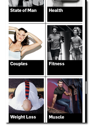
To wit: the TOC has been wisely transformed into a wall of tappable visual tiles with short heads. From a design perspective this is lovely. As information architecture it quickly become a blur of one-line indicators ?Health? Fitness? Style that feel random even though they are organized in the magazine?s sections. Likewise the pop-up TOC, which puts the contents into a marginally clearer icon+text scroll still lacks the detail. More tappable detail at the TOC level is needed for the reader to know what he is getting. Because MH repeats some general themes like style, health and fitness across front matter, features and columns, those tags are of nominal help to the drive-by reader. The design addresses the mobile experience with large, easily-seen structures. But in reality, to find what you want, the reader is tossed into a magazine lean-back mode that is not likely suitable to the circumstance.
See Also: Men's Health Upgrades to More Interactive iPhone Edition
But the real problem is simply that the original magazine organization and depth doesn?t translate to an app simply though smart design. This reader feels overwhelmed. Compared to The New Yorker, Men?s Health has many more small editorial elements that need to be managed in a small space.
But when it comes to design, the app excels. Once you do find your way to the article you want, the layout is optimal for smartphone experience. The splash page is lush and scrolls downward into a readable version of the article with page-at-a-time scrolling. Text is not adjustable, but we had no problem with the reading experience. Features that included embedded slideshows were handled adeptly. A feature on color let you scroll downward into successive slides.
Like The New Yorker iPhone app, MH can?t get around the scores of page advances it takes to get through a feature article on a smartphone. But unlike the New Yorker, MH lacks that critical triaging function that share tools provide. I could find no way to email, Tweet or otherwise share an article or an item, to myself for later reading or to others. This pretty much removes from MH for iPhone a natural utility?reading the snackable material on the phone and pushing the long-read material back to yourself for more comfortable consumption elsewhere.
The front matter of the magazine is the most enjoyable material to read and arguably some of the most mobile-friendly in MH?s monthly book. Each subsection is divided into a slideshow-like series of tappable text and images that fit the screen and the snackable milieu. Arguably, front matter in any magazine is the most mobile-friendly content. But kudos to MH for making it even more enjoyable on this platform.
Also great to see (or hear) is the inclusion of audio in at least one feature. Garrison Keillor's reading of his feature on a life of smoking and drinking is not to be missed. Still, good luck bookmarking the feature or the audio so you can come back to finish it in midstream later. The audio track doens't even let you know how long the narration lasts. There are a number of such usability oddities in this app. There doesn't seem to be an easy way to quickly scroll to the top of a long feature. The standard Apple technique of tapping the top of the frame does not work. Adobe's page view mode zooms the issue out into a thumbnail timeline of the layout, but just try using the scroll tool to move incrementally through pages. The scale is just all wrong for such minute navigational moves.
Embodying the entire experience of the MH app are the exercise illustrations?both elegantly designed while maddening to find and use. The simple line art concatenates the original drawings that demonstrate the start and end positions of the exercise into a neat animation. The problem is that the exercises are scattered throughout the editorial and across sections. Speaking as a gym rat who actually brings his devices into the gym with him I can only ask, are these guys nuts? No fitness enthusiast is going to waste time at the gym scrolling to find the exercises he saw in some section somewhere in the magazine three days ago. Without some simple way of saving content (there isn?t even a ?Favorites? function in this app) or collecting all of the exercises into one section, a cool animation became useless to me when I really need it.
There are many, many wonderful design touches in the Men?s Health iPhone edition. There are individual spots in the editorial that are a joy to tap and scroll. In that sense it is a great showpiece for the flexibility of Adobe?s publishing system that makes it easier to move magazines to smartphones. And that is the problem. The app feels like it was built more by Adobe than by Rodale. This is as mixed a bag as we have come across lately in magazine app-land. It is still more magazine than app. The material most usable and relevant to the mobile reader is just buried in with the rest, and the architecture has not been torn down and rebuilt thoroughly enough to make it a pleasant mobile experience. What is needed here is an editor who does what editors do?declare what his or her reader most needs to know and in what order. Smartphones add a new parameter?what readers can use or absorb in the unpredictable mobile context. The app needs to surface and save only the ?stuff? that is contextually ?useful.?
Grade: B-
?
Post Comment / Discuss This Story - Info/Rules
FOLIO: Magazine is pleased to provide you an opportunity to share your thoughts, comments & experiences about what is going on in the magazine industry. Some comments may be reprinted elsewhere online or offline. We encourage lively, open discussion and posts, and only ask that you refrain from personal comments and remarks that are off topic. We reserve the right to edit/remove comments. Thanks for being part of the FOLIO: community.
blog comments powered bySource: http://www.foliomag.com/2012/app-review-upgraded-mens-health-iphone-app
carrie underwood blown away chk ryan o neal dark knight rises trailer dark knight rises trailer vince young vince young
No comments:
Post a Comment
Note: Only a member of this blog may post a comment.